
Choosing the best font for your video

Basic Rules to Consider when Choosing Fonts for your Video
Many people now opt for ‘no sound’ whilst watching social media videos; in fact, 85% of Facebook videos are played without sound. As a result, text is now a common video component.
Kinetic text is a good way to give factual information on video
At Take One, as video creators for business, we have an added responsibility of choosing the best font for our clients’ corporate videos. But it’s not just the font to consider, it’s also the size (or point) and the spacing (or kerning) which all need to be put into the mix.
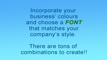
Our edit team work closely with clients to ensure that we stay within clients’ brand styles. It is not uncommon that the video component is omitted altogether from the brand guidelines, but it is essential that a business still incorporates the general brand guidelines for video simply as good practice, plus it helps to ‘get a feel’ for what fits the company style.
Which font should I select for my videos?
The message to your viewer must be legible, clear and understandable. Otherwise you run the risk of them being distracted or confused. Where possible, pick a font which represents the ‘message’ of the video:

For example, promo videos or video announcements using just a few words look good using a font like the one above. Using the font below in a story video or a paragraph however, is not recommended. Take a look at the 2 images below:
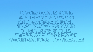
Do you find that the font used in the image above distracts you from the message?
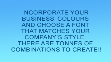
Do you find that the font used in the image above is easier to read and more legible?
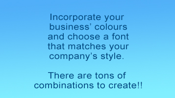
The use of both upper and lower case text should be used whenever possible as this makes the text easier to read. It might sound like common sense and perfectly logical, but graphics with unusual fonts or all upper case text take longer for a viewer to read. In turn, your audience will need more time to process and remember the message.
Using multiple fonts in the same video
Ideally, the same font should be used for all the text in your video. If a distinction needs to be made, you could try using a different font size, bold or a different colour.
Doing something like changing the font colour, is like varying the tone of voice.
If there are numbers in your message, viewers tend to notice and pay more attention when the font is bigger and in a different colour. The use of drop shadow can be used sparingly, to add extra emphasis when required.

What font size should I use?
When using a smartphone or other small mobile device, reading small text can be strenuous. There may be times when text needs to be dominant in a video (as in the above example), but generally speaking, the text should complement the image, not outweigh it. A Smartphone’s video frame is physically limited in size. Try to limit the amount of text to as few words as possible. Otherwise you run the risk of losing your message with too many words in a small font size.

The placement of the text within the video frame is as crucial as is the colours you decide to use, so bear in mind the background when composing your graphic. In the example above the blue text is lost in the background. Simply changing the colour is all that is needed to make it readable.

Consider the positioning of the text within the frame
Where you place the text on the screen will be determined by the image over which it will be placed. Simply moving the text can help to make the caption readable.


How important is font spacing (Kerning and Leading)?
VERY! If during your video, the text lines are very close, it becomes illegible and your viewer may not be able to decipher it easily.

Conversely, if the line spacing is too far apart, the text may not flow well for the reader, making it difficult to connect the message. Kerning refers to the horizontal space between letters on a line of text, and Leading refers to the vertical space between lines of text.

Choosing the best font for your videos may seem tricky to start with but, there are so many available for you to choose from. Don’t be afraid to have a play with size, colour, spacing and orientation (landscape, portrait or square). However, the Take One team do have a basic rule to bear in mind – ‘simple is best’ – just because you have lots of options, it doesn’t mean you should use them all right now! Choose carefully and stick with the same font throughout the video, unless you are looking to create a specific effect. If in doubt then using Arial or Helvetica is always the safest option – it’s clean, looks good and is very legible.


